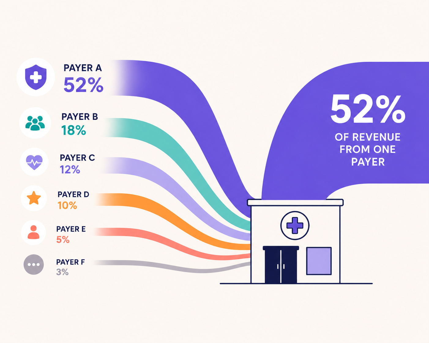
If you run a practice, you probably know which insurer accounts for the largest share of your revenue.
What most practice owners can’t answer as quickly is the more important question: What percentage of your collected revenue is actually from that one payer?
For ABA, pediatric therapy, behavioural health, home health, and other independent healthcare practices, that percentage can determine how severely a rate cut, authorisation change, payment delay, or contract termination impacts the business.
This guide gives practice owners and operators a concrete way to assess that risk. You’ll learn:
- How to calculate payer mix using collected revenue
- Why payer count does not necessarily mean payer diversification
- How a payer decision affects total revenue at different concentration levels
- Why Flychain uses 40% as a warning point for single-payer concentration
- How to improve payer mix without adding low-value payer contracts
Along the way, we’ll cover what payer mix in healthcare means and how to calculate it, why two practices with identical payer concentration can have very different economics, and why many practices struggle to see their true payer mix in the first place.
The analysis draws on financial data from 173 ABA therapy practices using Flychain.
Want to see if you’re leaving money on the table?
Get a free financial assessment from our healthcare accounting experts.
What payer mix in healthcare actually measures
Payer mix is the breakdown of a practice’s revenue by who pays for its services.
Most published definitions describe it as the split across commercial insurance, Medicare, Medicaid, and self-pay. That framing was built for hospitals, and it is only partly useful for an independent practice.
For a practice owner, the more useful version of payer mix is narrower and more specific: What share of the revenue you actually collected came from each individual payer? Not each payer category. Each payer.
That distinction matters because category-level payer mix can hide concentration risk.
A practice may generate 70% of its revenue from commercial insurance and appear reasonably diversified. But if a single insurer accounts for 55 percentage points of that 70%, the practice is still heavily dependent on one payer.
The category looks diversified. The revenue base is not.
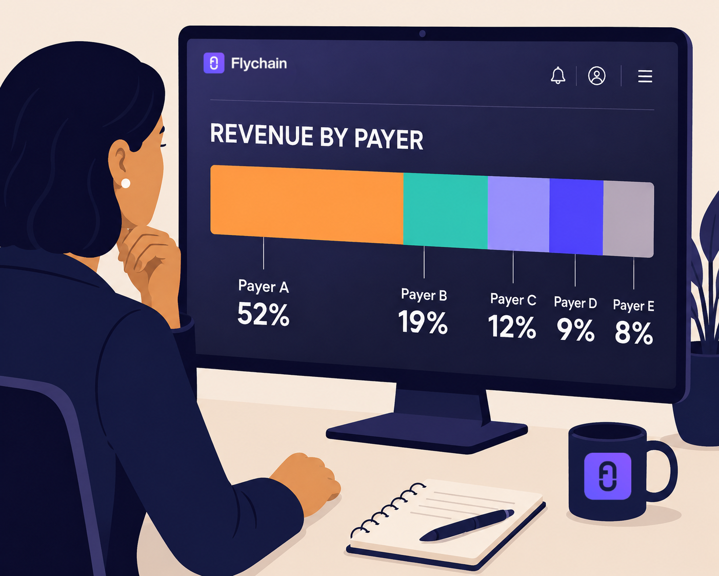
Payer mix versus payer concentration
Payer mix and payer concentration are related, but they measure different things:
For an independent practice, individual-payer mix and largest-payer concentration usually provide the clearest view of financial exposure.
How to calculate payer mix
The calculation itself is simple. For each payer, divide the revenue you collected from that payer over a period by total revenue collected in the same period, then multiply by 100.
- Use collected revenue, not billed charges. These are very different numbers, for reasons covered later in this guide.
- Use a trailing twelve-month window. Shorter windows get distorted by authorization cycles and seasonal volume.
- Calculate it monthly, not annually. Concentration drifts gradually, and an annual snapshot hides the trend.
- Rank payers largest to smallest. The single most important output is the share held by your largest payer.
That last number is the one to write down. If you want one figure that captures your exposure to payer concentration, this is it.
How many payers does the typical practice bill?
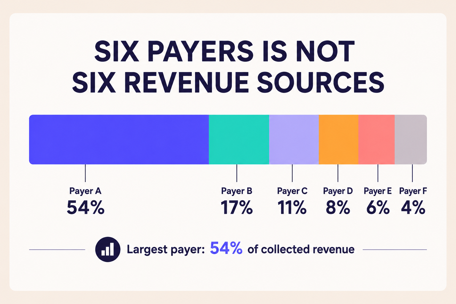
In an analysis of 173 ABA practices using Flychain, the typical practice billed six different payers over the twelve months ending July 2026.
Six sounds diversified. It often is not.
Across those same 173 practices, the books contained 499 distinct payers, ranging from national commercial insurers to state Medicaid programs, school districts, and regional behavioral-health authorities. Seventeen practices in the dataset billed no commercial insurer at all.
The important finding is that payer count and payer diversification are not the same thing.
A practice can bill six payers while still depending on one or two for the majority of its revenue. A payer representing 5% of collections poses a very different financial risk from one representing 50% - even though both count as “one payer” on a credentialing roster.
This is why simply counting payer contracts can create a false sense of security.
A practice may be contracted with six payers and still be highly concentrated. The question that matters is not just how many payers do you bill?
It is "what percentage of your revenue comes from your largest one?"
Payer concentration is also easier to catch early when it's tracked alongside the rest of a practice's billing health. A payer that's both concentrated and slow to pay, for instance, shows up in metrics like days to payment and net collection rate before it becomes a cash flow emergency. Raven Health's breakdown of ABA billing metrics worth tracking is a useful companion resource if you want to build out that fuller picture.
See your revenue broken out by payer, every month - without building the report yourself. Book a Flychain consultation.
The 40% threshold: how much payer concentration is too much
Some healthcare advisors see 50% as a warning point for dependence on one payer; some recommend lower limits. There is no generally accepted industry cut-off.
Flychain has a more conservative operating policy with its clients; to start treating concentration as high when one payer represents 40% of collected revenue.
This is an operating guideline, not an empirical cutoff for practice viability. But the logic behind it is straightforward, and it explains why the number is 40% rather than a rounder, more comfortable 50%.
Many independent practices operate on relatively thin margins, and much of the cost base cannot adjust quickly:
- Clinical compensation is shaped by a competitive labor market, not by what one payer decides to reimburse.
- Staffing and supervision requirements constrain how quickly labor costs can change.
- Rent, billing infrastructure, and administrative overhead do not shrink when reimbursement falls.
The math behind the threshold
Consider a payer representing 40% of practice revenue that cuts reimbursement by 20%.
That translates to an 8% reduction in total revenue. For a practice operating on an 8-15% margin, a single payer decision could erase most or all of its annual operating margin.
At 60% concentration, the same 20% cut produces a 12% decline in total revenue. Absorbing a hit that size may require cost reductions significant enough to affect clinical capacity, which reduces revenue further, which deepens the problem.
Seen this way, the concentration threshold is not arbitrary. Once a single payer approaches 40% of revenue, even a relatively contained change in reimbursement can put a meaningful share of the practice’s operating margin at risk.
The higher the concentration, the less room the practice has to absorb a decision it does not control.
4 types of payer concentration risk
Owners thinking about payer risk usually think about rate cuts.
Rates are only one of four ways a payer relationship damages a practice:
- A rate cut, applied unilaterally, with a short window to object.
- An authorization or medical-necessity policy change that reduces approved hours per client.
- Contract termination or non-renewal, which removes the revenue entirely rather than reducing it.
- An administrative disruption - the payer stays the same, but its claims processing breaks.
In March 2026, CareSource notified Georgia ABA providers that it would cut reimbursement rates by 20% across the board, effective roughly six weeks later. Providers had 45 days to object.
The timing left practices with limited alternatives. CareSource was the only care management organization in the market with a renewed contract; two outgoing plans were winding down, and three incoming plans were not yet in a position to credential providers or pay claims.
For some practices, the consequences were immediate. One Savannah pediatric therapy owner told local press that she would have to discharge all 89 of her CareSource patients. CareSource reportedly represented roughly one-third of her caseload. Caseload share is not necessarily the same as collected-revenue share, but it illustrates the scale of the provider’s operational exposure.
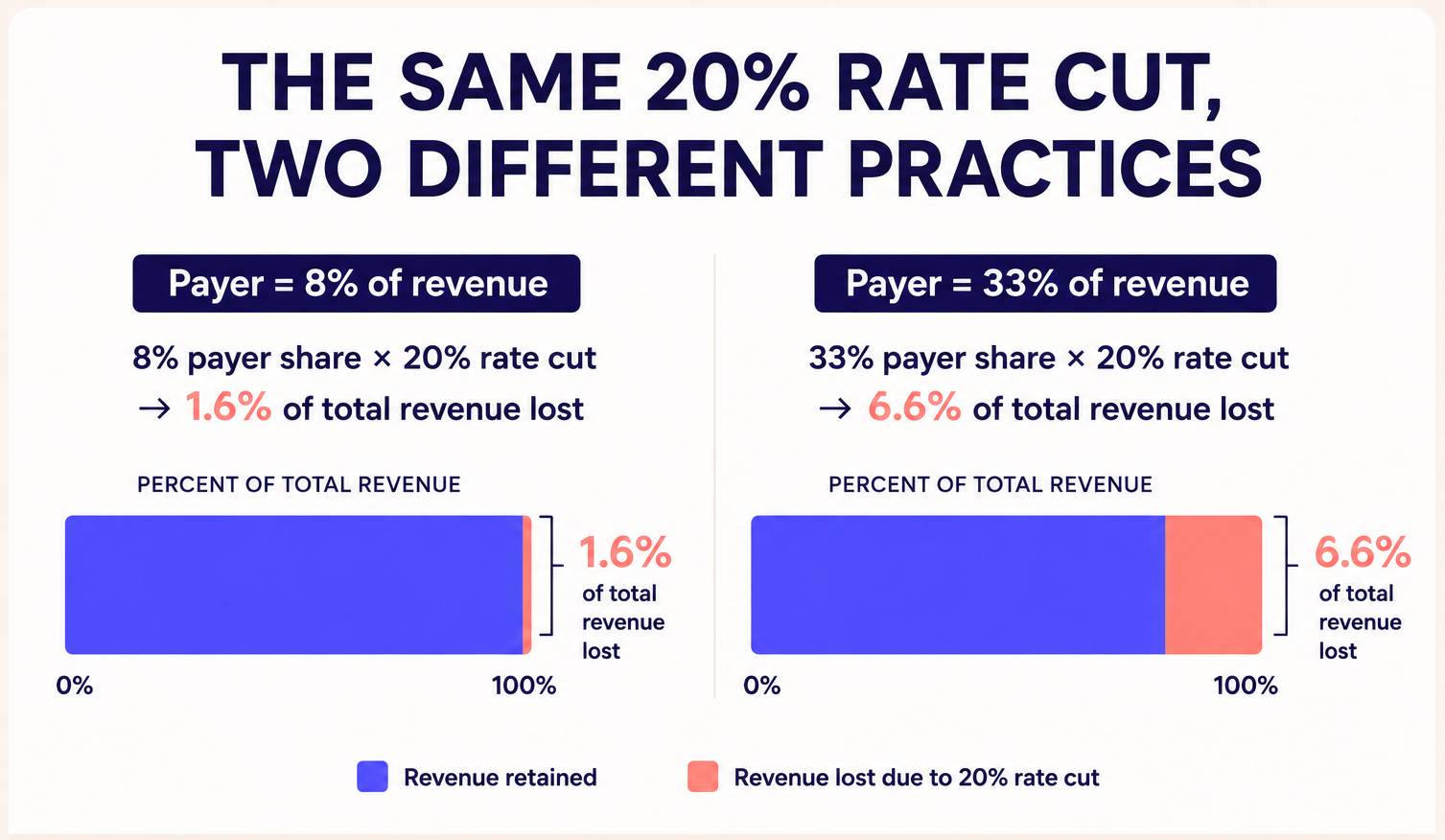
Now consider the same reimbursement cut across two practices: A practice deriving 8% of its revenue from CareSource would see a very different financial impact from one deriving 33%.
Same payer. Same 20% cut. Entirely different level of risk.
The difference is payer concentration: a number shaped months or years before the rate cut ever arrived.
When the payer stays the same but the plumbing breaks
On January 1, 2025, TRICARE began operating under a new generation of regional contracts, with TriWest Healthcare Alliance replacing Health Net Federal Services in the West.
The benefit did not change. The rates did not change. The administration did.
In the West, providers and beneficiaries encountered referral and authorization problems. In the East, provider-record and claims-processing issues contributed to delayed and unpaid claims.
By May 2025, roughly 16,000 providers in the East Region were reportedly affected by payment issues, with some owed more than $100,000.
For ABA providers, there was an additional complication. As disruptions in the West mounted, the Defense Health Agency temporarily waived referral-approval requirements for many outpatient specialty services. ABA and Autism Care Demonstration services were explicitly excluded from that waiver.
This is another form of payer concentration risk. If a payer represents 15% of revenue and payments are delayed, the practice has a serious receivables problem that cash flow from other payers may help absorb.
If that same payer represents 55% of revenue, the disruption can quickly become a payroll and liquidity problem.
The clinical operation did not change. The reimbursement rate did not change. Only the practice’s exposure to the disruption did.
Why reimbursement rates change the value of your payer mix
Two practices can have identical payer concentration and very different economics because not all payer contracts reimburse the same service at the same rate.
Flychain analyzed negotiated commercial rates published in Transparency in Coverage data for ABA providers across the Washington, DC metro area.
For CPT 97153, one of the highest-volume codes for many ABA practices, the median negotiated rate per 15-minute unit was $10.00 with Cigna, $15.00 with Aetna, $13.82 with Optum/UnitedHealthcare at the HM/RBT tier, and $15.66 with Optum/UnitedHealthcare at the HN bachelor-level tier.
The full breakdown is available in our analysis of ABA reimbursement rates in the DC metro area.
That is a difference of more than $5 per 15-minute unit - or more than $20 per hour of direct therapy - depending on the payer and applicable credential tier. Across thousands of units each year, those differences compound quickly.
These figures are specific to commercial rates in the DC metro. They are not Medicaid rates or national benchmarks, and individual contracts vary. The transferable takeaway is not the specific dollar amount. It is that the same clinical service can carry meaningfully different reimbursement rates depending on the payer contract.
That changes how you should think about payer concentration.
If a large share of your volume sits with one of the lowest-paying payers in your market, you have two problems at once: your revenue is highly concentrated, and that concentration sits in a relatively low-paying contract.
Two different uses of rate data
Rate benchmarks serve two very different purposes, and confusing them can lead to the wrong conclusions.
- Comparing rates across payers helps you evaluate which networks are most financially attractive.
- However, note that those comparisons typically carry limited weight in a rate negotiation. What Cigna pays does not establish what Aetna is willing to pay.
- Comparing rates within the same payer helps you negotiate.
- If the same payer reimburses a comparable provider in your market at a higher rate for the same service, that provides evidence that a higher reimbursement tier exists and gives you a much stronger benchmark for a rate increase request.
Rate alone, however, does not determine the value of a payer relationship.
What to measure for each payer
Authorization requirements, denial rates, payment delays, and administrative burden all affect the economics of getting paid.
Understanding how individual services are reimbursed matters too - our guide to ABA CPT codes and reimbursement explains how the major codes fit together.
The goal is not simply to spread revenue across more payers. It is to build a payer mix that balances concentration risk, reimbursement rates, and the operational reality of getting paid.
Find out whether you’re underpaid before your next contract renewal. Flychain benchmarks your rates against other providers in your market.
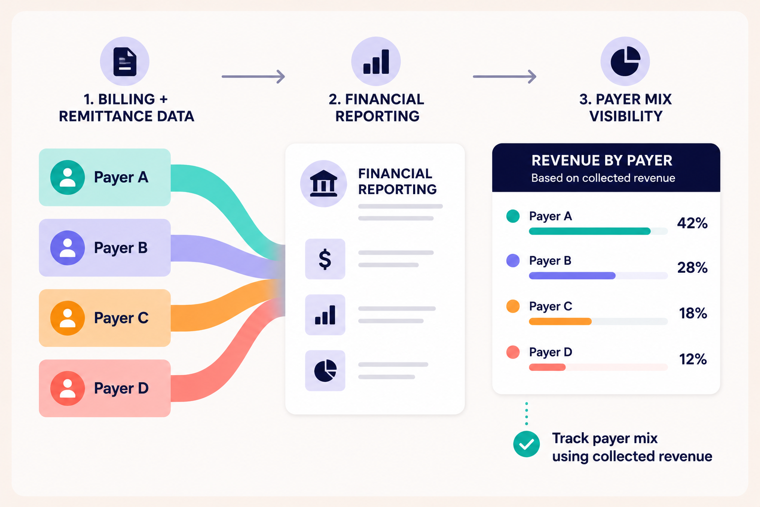
How can practices see their own payer mix?
A useful payer mix analysis starts with a simple question: What percentage of the revenue you actually collected came from each payer?
Answering it requires connecting financial reporting with payer-level data.
Traditional bookkeeping often records deposits as broad categories such as “Insurance Revenue,” while the payer-level detail remains in billing systems, remittance data, or other upstream sources. A standard P&L may therefore show how much revenue the practice collected without showing which payers generated it.
Practice management and billing systems can provide that additional detail, but there is an important distinction to make: billed revenue is not the same as collected revenue.
A payer may represent a large share of claims submitted but a much smaller share of actual collections once denials, payment delays, authorization limits, and other reimbursement issues are accounted for.
Measuring payer mix using collections gives owners a clearer picture of the revenue actually supporting the business.
The most useful approach is to bring payer-level billing or remittance data together with financial reporting and track the result consistently over time.
At a minimum, a practice owner should be able to answer three questions each month:
- What percentage of collected revenue comes from each payer?
- Which payer represents the largest share?
- And is that concentration increasing or decreasing?
That visibility turns payer mix from something you estimate into something you can actively manage.
How to improve your payer mix: a six-step framework
The goal is not to add payers for the sake of adding payers. A stronger payer mix reduces concentration while improving the overall economics and resilience of the practice.
1. Measure your current concentration.
Start with the last twelve months of collected revenue by payer. What percentage came from your largest payer? From your top three?
2. Understand the economics of each payer.
Look past contracted rates to what you actually collect, how quickly you get paid, denial rates, authorization requirements, and the administrative effort the relationship consumes.
3. Benchmark before you credential.
Compare reimbursement for your highest-volume codes across payers in your market before deciding which networks to pursue. This is the step most practices skip entirely.
4. Diversify strategically.
The best new payer is not simply another logo on the list. Ideally, it has meaningful membership in your service area and attractive reimbursement for the services you deliver most often, which lets you reduce concentration and improve your blended rate at the same time.
5. Renegotiate existing contracts.
Where market data shows the same payer reimbursing comparable local providers at higher rates, use those benchmarks as evidence.
6. Revisit quarterly.
Payer mix concentration changes without anyone deciding to change it, as referrals, client volume, and authorization patterns shift.
There is a timing reason to start before concentration becomes a problem.
Adding a payer relationship can take months. By the time a major payer cuts rates, changes policy, or terminates a contract, there may not be enough runway to diversify meaningfully.
Payer mix is easiest to fix while it still looks like a theoretical problem.
Payer concentration guidelines: what good looks like
There is no universal concentration threshold that applies to every healthcare practice.
As a directional framework, Flychain uses the following ranges when evaluating payer concentration risk.
Two practices at the same tier can still differ substantially, which is why the benchmark table is a starting point rather than a verdict.
A practice at 45% concentration with a well-paying, fast-paying payer is in a materially better position than a practice at 45% with a slow, low-paying one.
Frequently asked questions about payer mix in healthcare
What is payer mix?
Payer mix is the percentage of a healthcare practice’s revenue that comes from each payer or payer type.
Traditional definitions often describe the split across commercial insurance, Medicare, Medicaid, and self-pay.
For an independent practice, it is also useful to measure payer mix at the individual-payer level. For example, the percentage of collected revenue coming from Aetna, Cigna, or UnitedHealthcare, because this reveals payer concentration risk.
Why is understanding payer mix important in healthcare management?
Understanding payer mix is important because it shows how dependent a healthcare practice’s revenue is on individual payers and how exposed the practice is to changes in reimbursement, contracts, or payment policies.
Reimbursement rates, authorization requirements, and contract terms are set by payers, not by the practice. Payer mix in healthcare determines how much of the business is exposed to any one payer’s decisions.
A well-diversified practice has more room to absorb an adverse change and more flexibility to shift volume elsewhere. A highly concentrated practice may see the same change flow directly into revenue, cash flow, and operating margin; often on a timeline set by the payer rather than the practice.
How does payer mix impact revenue and financial planning?
Payer mix impacts both how much revenue a healthcare practice earns and how predictable that revenue is.
- Revenue: Different payers can reimburse different amounts for the same service. As a result, shifting patient volume between payers can change total revenue even when clinical volume remains unchanged.
- Financial planning: The more concentrated a practice’s revenue is with one payer, the more its financial forecast depends on that payer maintaining its reimbursement rates, payment performance, and contract terms.
That makes payer mix a planning issue, not just a reporting metric. Hiring plans, lease commitments, and expansion decisions all rely on future revenue assumptions. If one payer represents half of collected revenue, a significant change from that payer can materially affect the assumptions underlying those commitments.
Understanding payer concentration before making long-term financial decisions helps a practice distinguish between a calculated risk and one it has not yet measured.
What is a good payer mix for a healthcare practice?
A good payer mix avoids excessive dependence on any single payer while maintaining financially sustainable contracts.
As a directional guideline, Flychain considers a largest-payer share below 30% relatively low concentration, 30-40% moderate, 40-60% elevated, and above 60% high.
These ranges are not universal benchmarks and should be considered alongside reimbursement rates, payment performance, specialty, and local market conditions.
Should I drop a payer that reimburses below market?
Usually not as a first step. A practice should first evaluate the payer’s reimbursement rates, collection performance, administrative burden, patient volume, and available alternatives.
Where appropriate, consider renegotiating the contract and credentialing with alternative payers before gradually reducing exposure. Dropping a major payer without replacement volume can create a sudden revenue gap.
How do I find out what other providers are paid?
Commercial insurers are required to publish negotiated rates in Transparency in Coverage machine-readable files, which can be used to compare what a payer reimburses different providers for the same services. These files are public, but they are extremely large and difficult to analyze manually.
Flychain does that analysis for healthcare practices through Transparency Thursdays, where we publish free reimbursement benchmarks using payer-published rate data. Each analysis shows how rates vary across providers and helps practices identify where their own contracted rates may sit within the market.
For example, our Optum ABA Reimbursement Benchmarks for Florida analyzed published rates across 515 in-network Florida entities, including the median, 90th percentile, and 95th percentile rates for key ABA CPT codes.
You can browse all of Flychain’s published reimbursement benchmarks in our Free Downloads library.
How do you calculate payer mix?
Calculate payer mix by dividing the revenue collected from each payer by total revenue collected over the same period, then multiplying by 100.
For example, if a practice collects $400,000 from one payer and $1 million in total revenue, that payer represents 40% of the practice’s payer mix. Use a trailing 12-month period, update the analysis regularly, and rank payers from largest to smallest to identify concentration risk.
How long does it take to change your payer mix?
Changing payer mix typically takes months rather than weeks because practices may need to credential with new payers, build new referral sources, and gradually shift patient volume.
The exact timeline varies significantly by payer, specialty, and market. This is why practices should monitor payer concentration before it becomes an urgent financial problem.
Your payer mix is a decision, not an accident
Everything above points to the same conclusion: payer concentration can turn a decision outside your control into a financial problem inside your practice.
The providers affected by the CareSource rate cut and the TRICARE transition did not need to be poorly run to feel the impact. The more dependent a practice was on the affected payer, the less room it had to absorb the disruption.
So the question is not whether your payers will behave predictably next year.
It is whether you could answer, right now: What percentage of last month’s collected revenue came from your largest payer?
If you can answer that in under a minute, your payer mix is something you can actively manage. If you cannot, your first step is simply to make it visible.
Flychain’s healthcare business intelligence platform gives practices monthly visibility into revenue by payer and benchmarks contracted rates against comparable providers in the same market, helping practices identify both payer concentration and potential underpayment while there is still time to act.
Know your payer mix before your next contract renewal.
Book a consultation with Flychain and see your revenue by payer.